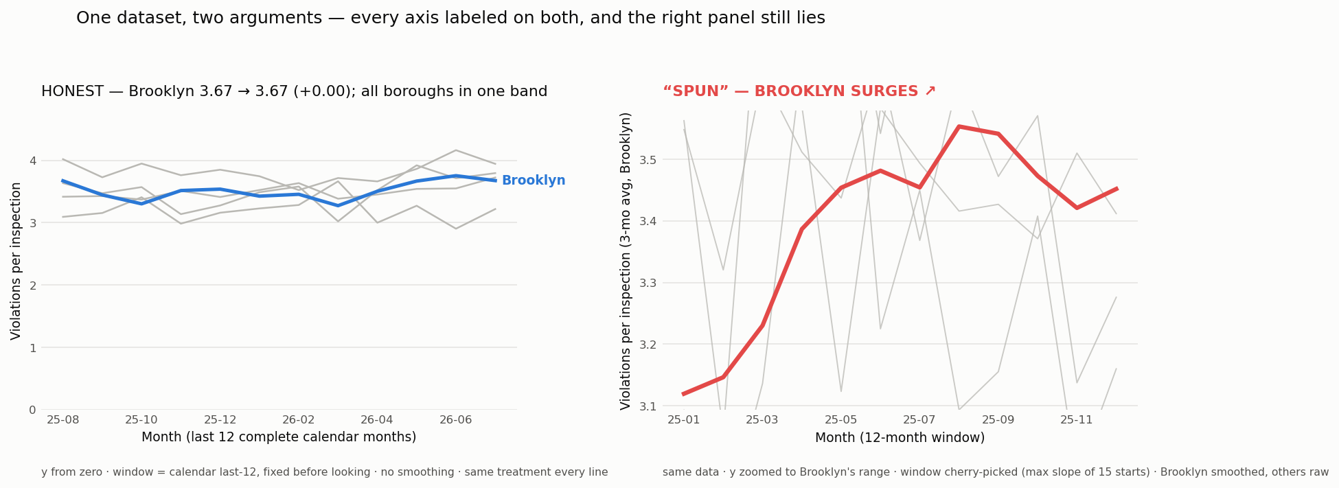
On the chart-spin tab there are two renders of the same query — an honest one that says Brooklyn is flat, and a spun one that shouts a surge. The gallery can only tell you they're the same data. This page shows you: one chart, pinned to your screen, changed only by scrolling. No number changes at any point. Scroll back up whenever you don't believe it.
rate = violation citations ÷ distinct inspections · NYC DOHMH · live from the API
The honest chart
Violations per inspection, five boroughs, the last 12 complete months, y-axis from zero. Brooklyn: → . Flat — and its drift ranks third among the boroughs.
Keep your eye on the numbers. They never change again.
Lever 1 — baseline
Zoom the y-axis to Brooklyn's own range and a wobble fills the whole panel. Every value is identical; the frame around them shrank.
There's even a true rule to hide behind: line charts don't have to start at zero.
Lever 2 — window
Slide the window back to start at Brooklyn's trough. This start was found by searching all possible 12-month windows for the steepest Brooklyn slope.
That search leaves no trace on the chart. You only know it happened because this page tells you.
Lever 3 — aspect ratio
Squeeze the panel tall and narrow. Every slope on screen gets steeper — the data hasn't moved.
Nobody ever checks aspect ratio.
Lever 4 — smoothing
A 3-month average — for Brooklyn only. Its line becomes clean “signal” while the raw gray boroughs read as noise around it.
The real chart disclosed this. In 5.5-point type.
Levers 5 + 6 — color and the title
Alarm red, and a headline that states the conclusion. This is the spun render from the gallery, rebuilt in front of you.
Every one of the six choices can be defended in a meeting by pointing at a real rule. That's how charts lie in real life — nobody fakes a number. They pick a frame.
Now reverse everything at once
Brooklyn: → . Same numbers, start to finish. You watched a true chart become a false one — and there was no single moment it stopped being true.
That's why the method has to travel with the image. The picture can't tell you what was done to it.
What this piece fired: six of the seven levers listed on the chart-spin tab — window, baseline, aspect ratio, smoothing, color, caption. The seventh, encoding (changing the chart form itself), is covered by the map and bump charts there.
datasets/borough-series.json, exported by the same guarded pull that
drew the static PNGs. The order is a display choice too — we fire the levers
one at a time so you can see each one, but in a real spun chart they all hit at
once. The final step reverses everything at once as the check that no data changed.
← back to the DataHub · static side-by-side (the no-JS fallback)